Sunday, August 16, 2015

Stick with Me by Flora Worley

[This article was originally published in The Comics Journal # 217, November 1999.]

Reporter
Dylan Williams
Self-published


Lamentably, most of the mini-comics I read don't stay with me long after I read them. Most of their stories - and here I don't mean to include the more anecdotal, gag, or strip-format minis - run about ten pages long and do not reach, in that short spell, a narrative or thematic complexity. Dylan Williams' Reporter series is an exception to this norm. Reporter is thoughtful and unusual, thematically complex and reflective of the process of writing. Reporter also tells a good, albeit ambitious, story.

To give a sense of the narrative, I'd like to go into a bit of detail about the first issue of the series. Reporter #1 kicks off the story of two very different writers, Adam and Ivar, living in the town of Willoughby. Period-fiction writer Adam sits across the table from "natural history" diarist lvar (who aspires to record everything) at a local diner. Adam is called outside by his "muse," a bandaged character dressed in Mafioso suit and hat, who strongly suggests that he pay attention to the immanence of death. Adam returns to the table and tells Ivar of his predicament: he owes his muse for a story idea he solicited. The story, which Adam relates to Ivar, is a metaphor for writing about two kids' discovery of an underwater stone giant. Reporter #1 ends with Adam's resolution to return the story idea and to start telling the truth in his writing.

In Reporter #2 Ivar's dedication to his project of recording everything abbreviates a developing relationship with a young ghost named Felicia Frame, who herself has "baggage" that interferes in the affair. The issue ends with Ivar leaving Willoughby on a bus, bound to continue his work in the next town. In Reporter #3 Adam, in his quest to tell the truth, has become an aspiring reporter stuck doing the more lowly jobs at the local newspaper. While working over the weekend he is interrupted by four robbers who are fleeing a heist. They intend to take him hostage, but he gives them the slip. Adam's run-in with the criminals turns out to be a stroke of luck as it provides his claim to writing the newspaper story about the whole event. This story - it has the feeling of a story within a story, as if it may be an intrusion of Adam's “untruthful” imagination - is another of Williams' ways of suggesting that weird, extraordinary forces are at work in life, interfering in different ways, and that these may even be given credit for "making life interesting."

Aside from the more anomalous forces at work, the past plays a leading role in Reporter. The past, represented by ghosts, flashbacks, and the abrupt return of old "skeletons," keeps popping up and manipulating the sequence of events. This experimenting with the time is perhaps most self-consciously explored in a three story progression in the Reporter Short Story Collection which has a sequence of events happen in reverse time. In other words, the B is given before the A, and everything that goes on in between, the bulk of each story, is revealed as a very odd series of means to all end. If there is a point to all this manipulation of time, it's that one never knows when the past will come back a'haunting or exactly how any situation will give rise to future events.

Another theme at play in Williams work has to do with the reflective process of writing. There are two different versions of truth for Adam and Ivar. Adam is two-sided, wedded to reportage in his job, but strongly inclined to flights of imagination, while Ivar would like to record - to simply get down everything that is going on around him. One wonders if their habits in fact become crossed, in a way, being that Ivar's "natural history" notebook surely contains an account of a ghost and Adam's wild imagination was, perhaps, surpassed in extraordinariness by the real events in #3.

When I first picked up Reporter #1 I was given to the idea that Williams' artistic style was nothing all that interesting, nothing all that unusual. However, that was before I realized that there is a definite function to the simplicity of Williams' renderings. Williams' simple artistic style juxtaposes nicely with the narrative complexities in the story he is telling. The main characters in the narrative arc simply, consistently drawn and made to look like the epitome of who they are. Adam looks highly plausible as a young adult writer, simply dressed yet expressive. Ivar looks like what you would imagine a dweebie fifteen year old introvert intellectual would look like: always dressed in a suit and bow-tie and is reserved both in terms of facial and bodily expression. The more fantastic characters that they come into contact with, the same fantastic characters that influence their lives so much, are simply drawn yet aren't so stereotypical. When I think of a muse, an art-nouveau picture of a beautiful woman pops into my head - a far cry from Williams' bandaged marauders. Ivar’s love interest, Felicia Frame, hardly fits with the popular image of a typical ghost in style or in manner. She is about the least scary and most "everyday human" apparition in spook history. What I find so interesting - almost eerie - is that these fantastic characters are made plausible in that they fit almost seamlessly into the narrative. It is as though Adam, Ivar, and the few other realistic character are pausing all the time just long enough to remark "hmm, odd" as though they themselves recognize the improbability of these characters.

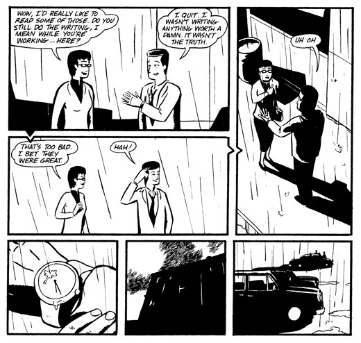
Aside from these general tendencies in Williams' Reporter series, there are a few very interesting artistic tools which he employs. He builds directional arrows right into the panels so that they distort the borders. Flashback scenes, which are particularly abundant in the short story collection are rendered with either charcoal or very soft graphite while the present time story is rendered in sharp inked lines. In terms of narrative features, Williams based the story in number two on David Lean's A Brief Encounter and got the death threat scene in number one from Jack Nicholson's script for the film Flight to Fury.

Certainly, Williams earned the Xeric Grant that helped make Reporter #3, including its beautiful cover, possible. His artistic and narrative styles are extremely complimentary and he has a good feel for dialogue. Though Reporter is rife with seemingly fantastic characters and situations, overall it has a very real feel to it. There is, however, a plot lurking in the background - involving a stolen antique - that threatens to unify the related situations into one grand, conspiracy-theory-informed plot. I worry that the development of this plot will push Reporter away from its realistic strangeness into epic blockbuster, though all I can do at this point is wonder and eagerly await Reporter #4.

Flora Worley

Saturday, March 28, 2015

George Roussos 1915-2000

Comics veteran George Roussos died of a heart attack Feb. 19 at the Southside Hospital in Bay Shore, N.Y. Roussos was a man of many parts, and his interests ranged from astronomy to photography, but his work as a comic artist was strong enough to turn such comic-book greats as Alex Toth and Jack Kirby into fans. Almost everyone in the field knew something about "Inky," a nickname given Roussos by artist and editor Bob Wood of Crime Does Not Pay fame.

Roussos worked in comic books and strips for an amazing 60 years, straight through. He worked for nearly every major publisher, worked in every aspect of comic production and managed to set the look for the most recognizable pop icon of the 20th century.

Roussos was born Aug. 20, 1915 in Washington, DC, to William and Helen Roussos. He and his two sisters, Helen and Alice, were orphaned at a young age and he spent his youth at the Brooklyn Orphan Asylum. He went to school at PS 125 in the Woodside area of Queens, NY, where he started drawing for the school paper. Roussos told close friend Bill Cain, "I was always interested in the newspaper comic strips. I actually learned the basics of comics production from Frank Miller's strip, Barney Baxter. I would imitate Frank's style and send him samples of my work. He'd critique my work and I'd learn from his comments and criticisms." Roussos has said he was most influenced by the artists Chester Gould, Stan Kaye, Robert Fawcett and Hal Foster.

With an indelible knack for adaptability, Roussos broke into the comics in 1939 doing lettering for a Spanish language version of the Ripley's Believe it or Not strip. He couldn't read Spanish, but as he told Mark Gruenwald, "It wasn't as hard as it sounds. I know Greek and there's a lot of similarity between the two languages." In 1940 Roussos answered, along with 60 other applicants, an ad in the paper that was hiring assistants for Bob Kane on the Batman comics published by National (DC) Comics. George's familiarity with comic production, thanks to Miller's advice and his own skill, got him the job. Bill Finger wrote the stories, Jerry Robinson would draw the people and Roussos would do almost everything else (including drawing backgrounds, inking, lettering and possibly coloring). Though Batman was quite popular, Roussos wasn't fazed by the character's success. "I needed a job," he told Jon B. Cooke (The Jack Kirby Collector #18 - January 1998).


After a few years Roussos moved on to work directly for DC Comics on Vigilante, Johnny Quick, Superman, Starman and most notably Airwave: "I had so much fun with this title because I could do almost anything with the character. It was only five pages, so I could go in many directions." He turned a little known filler character into a work of art, remembered to this day. On Airwave Roussos began, in earnest, a lifelong passion for experimentation with every aspect of the art including coloring. "One thing I did in an Airwave was use only grays," he said. "Mr. Leibowitz, who was the publisher, came in. 'George' he said to me, 'Where's the color?' I said 'This is a different effect. This is color but it's different.' I don't know what the hell I said! I made it up! He walked away and after a while he said 'I'm talkin' to another nut!'"

During his time at DC, fellow artist Stan Kaye became a friend and mentor of sorts, taking the place of the art schooling Roussos had never had. Roussos continued working for DC Comics off and on through the end of the 1960s. Roussos would sometimes draw the whole package, but often he would sign on as an inker, letterer and/or colorist. He was recognized by editors as a superlative drawer of settings and backgrounds.

During the 1940s, Roussos worked for companies like Timely, Standard, Avon, Fiction House, Family, Better, Spark, Hillman and Lev Gleason, among others. Through DC, Roussos also produced a series of 16 comics for General Electric in the early' 40s; he told Bill Cain, 'These pamphlets were distributed 111 schools throughout the country and South America, Europe and India. I received an extension from the local draft board in order to complete this publication. When the work was over, the bomb ended the draft. This is a good thing for the Army ... they might have lost the war!" There were 68 million of the pamphlets distributed, according to an article in the New York Daily News. He worked on an advertising comic for Thom McAnn Shoes in 1944 and '45. During this time, Roussos also began a long period of working as, his usual, inker/ penciller/ letterer/ colorist with fellow comic artist Mort Meskin. Roussos told me that Meskin, suggested opening an art school. "We rented this room for about 25 bucks a month and we [set up] chairs and everything," Neither of them were too business minded though, "We bought orangeade and made tea and coffee, so the profit went out the window, plus paying the model."

One thing Roussos was always very adept at was dealing with authority. While working at DC he had a run in with editor Mort Weisinger: "His trick was to give you a job to ink and he would have your job to ink and another job ready. The third week, you go up there and there was no check and no story. He would watch your expression. Now he's got you at bay. Finally, you'd say 'Where's my check Mort?' He said 'Oh, the check!' and all that, try to see what my reaction would be. He'd hope for me to get angry. I said, 'Mort, forget about it.' So, I pulled out some change from my pocket, about a dollar fifty or so, and I said 'Don't worry, I can get along with that very nicely. Whenever you have my check, fine. I didn't want to give in to his tricks."

The comic books weren't enough to keep Roussos busy and he branched out into newspaper comic strips over and over again throughout his career. He worked, as always, in many capacities on The Lone Ranger, Judge Parker, Judge Wright, The Phantom, and Flash Gordon during the 1940s, '50s and '60s. He also came up with a number of finished proposals for his own strips: 2001 A.D. (in 1945, 20 years before the movie), Azeena (1967), an archeology strip and Transisto (in the late '60s with writer Bill Finger, but these ideas never made it into the papers.

During the 1950s he worked for outfits like St. John, EC, Atlas and Crestwood (a shop run by Jack Kirby and Joe Simon). He returned to Atlas, now Marvel Comics, in 1964 where he worked under the pseudonym "George Bell." Stan Lee needed a fast and good inker. Roussos told Mark Gruenwald (in Comics Interview #2), "I could sit down and ink 24 pages in about a day. I sat down with a pen and outlined a whole job in about 10 hours (less with a brush) then went back and spotted blacks. But I wouldn't bring it in the next day, because I didn't want them to know I was so fast.” Roussos even worked for Warren publishing for a brief time in 1970 and '71.

After working for Marvel for years, in 1972 he joined the staff of in-house artists and began a second career in comics, as a full-time colorist, taking over the position after Marie Severin quit. Roy Thomas, chief editor at Marvel, from 1972-'74 remembers Roussos as somebody who knew what he wanted: "I liked his coloring and we got along real well. We used to go around and around about one little thing. When he was coloring interiors, whenever Spider-Man, who wore red and blue, leapt from one wall to another, he was always leaping from a yellow wall. Whatever wall he headed for suddenly became yellow when he landed on it to contrast. He would say, 'You've got to have contrast: and I would say, 'There's also got to be continuity.'" Roussos' amazing color sense reinvented the look of Marvel books, particularly the covers. He believed that colors in comics had to be simple and striking and developed a unique approach to using white that would "make a white seem whiter than the paper it was printed on," he told Gruenwald. His color sense is unmistakable. He was working on cover proofs and corrections until his death this year. He still continued to do hand coloring as a back-up, even when computer coloring became the norm in the '90s. As usual, playing down his own role, Roussos told me in 1999, "A very easy job, I have now."

In the 1950's Roussos began a lifelong interest in photography which would eventually lead, in 1984, to The Bayard Cutting Arboretum, a book, of his photographs and writings on the history of a local (Oakdale, NY) estate. Flo Steinberg, longtime Marvel Comics staffer, puts it best: "George was many dimensional" Steinberg knew Roussos from his days as "George Bell" but in the 1990s the two began sharing a workspace in the Marvel offices. "He was a very learned guy," she said. "He was always reading: papers, books, magazines. He had such eclectic tastes, he could be reading about history, philosophy, ethics, politics or architecture. He was very erudite and had sophisticated tastes. As a young man he had traveled all around the world."

Roussos, always the philosopher, told me his ideas on art: "Our natures are expressed in the way we work. Some people are very meticulous in the way they live, the way they do things, and it expresses itself in their work. When you find a detailed artist, he's usually not a very creative artist. In order to make up for it, he becomes meticulous. When you look at his work you see everything in order.You appraise him on that value. People who are more creative, they are more or less like [their] handwriting.You know how some of the guys write with this wild handwriting, even, terrible penmanship? The same thing with [their] artwork. Technique, usually, is a disguise for creativity. Sometimes you don't need creativity, you need people with technique. It's a toss up."

Roussos, a Leo and astrology buff, always noted that his life was full of Geminis: "The first artist who helped me out (Stan Kaye) was a Gemini. So was the second, Mort Meskin. My two wives were both Geminis." His first wife's maiden name was Viola Fink; they had met at school in their youth. Roussos married his second wife, Florence Lacey Nov. 17, 1980. The second Mrs. Roussos passed away in 1998. He is survived by his sister (Alice), three sons (William, Robert, and Louis) a daughter (Marie), four grandchildren, and four great grandchildren.

One thing that everyone I talked to about Roussos has noted is that for the last 20 years of his life, he would always take time, even in the dead of winter, to go the nearby park, the Sportsmen's Club and feed the deer. His daughter Marie has told me, "The deer knew him and did not run from him."

Two interviews of Roussos are being printed in the comic magazines: Alter Ego (6/00) and Comic Book Artist (4/00). You can send any letters to the family of George Roussos, care of Marvel Comics, 387 Park Ave, South, New York, NY 10016.

Dylan Williams

[Originally published in The Comics Journal # 223, May 2000]

Thursday, February 26, 2015

Jack Staff: Yesterday's Heroes

This article was originally published in the Bullets section of The Comics Journal #244, in June of 2002.


Jack Staff:
Yesterday's Heroes

Paul Grist

Dancing Elephant, ISBN: 0954226402

Paul Grist is a one-man band. He single-handedly creates and publishes two regular comics series: Kane has been running for about 10 years now, and in 2000, Grist launched the lighthearted superhero yarn Jack Staff. The first Staff collection, Yesterday’s Heroes, collects issues 1-4 of the series with some new art as well as a new story page.

Staff is a superhero book. I realize this genre can be quite off-putting to some people. It shouldn't be, particularly in this case. Grist's skill is that of a great storyteller in the tradition of C.C. Beck and, like Beck, no matter what genre he picks, the work itself stands on its own.

Yesterday’s Heroes is based on an issue of Captain America from 1981, featuring the British superhero Union Jack. Grist says in the introduction to Staff #4 that he never found out how that story ended, thanks to Marvel's spotty English distribution, but that it had stuck with him for years. In an effort to fairly judge the new work, I looked up the original comic, Captain America #253, written by Roger Stern and penciled by John Byrne. It's a fun comic, but what's amazing about rereading that 20-year-old comic is how much Grist has done with such a simple pulpy idea. Your time is better spent on Jack Staff than on the Marvel comic.

This series is lighthearted in much the way the best Hammer films keep you watching in spite of their silliness. It's a classically fun page-turner. The story twists and turns between the present-day hunt for "Albert Bramble, vampire hunter" and World War II, where Jack Staff and Sgt. States (who bears a passing resemblance to Captain America) battle a Knight-Templar-turned-Vampire. All very pulpy and fun with no hint of "higher meaning," but plenty of entertainment.

Grist's art really stands out. He draws in an immediate, calligraphic style, like reading a diary comic that happens to be an exciting story. His composition is exciting but subtle and only veers into the highly graphic use of shapes, at which he excels, when it suits the story. Even the slow pages are exciting to look at. Using only black-and-white linework on the interior pages (with a few color pages in the original serialization, but not the collection), Grist manages to come up with page after page on par with the best in classic Japanese printmaking and the great film noirs. His color work manages to achieve the same immediate calligraphic sense the black-and-white work has, but done with the practiced skill of an accomplished watercolorist.

Grist has taken the sensibilities of an idiosyncratic and personal storyteller and then applied them to a comic form known for its adherence to conventions. The pacing of each issue reminds me more of Love and Rockets or the comics of John Porcellino and Kevin Huizenga work than it does of a conventional superjock comic. Like these artists, he has taken the conventions of a specific genre and made them fit to his own vision. Grist expects the reader to keep up with quick changes and jumps in story threads that no conventional hero comic would allow. Not to say that it is overly complex; it is more that he recognizes his adult reader doesn't need to be led by the hand through a story.

Paul Grist, with both Kane and Jack Staff, is making well-crafted pulpy entertainment, the kind of stuff comics used to be known for. At the same time he is also doing some of the best and most subtle graphic design in any field.

- Dylan Williams